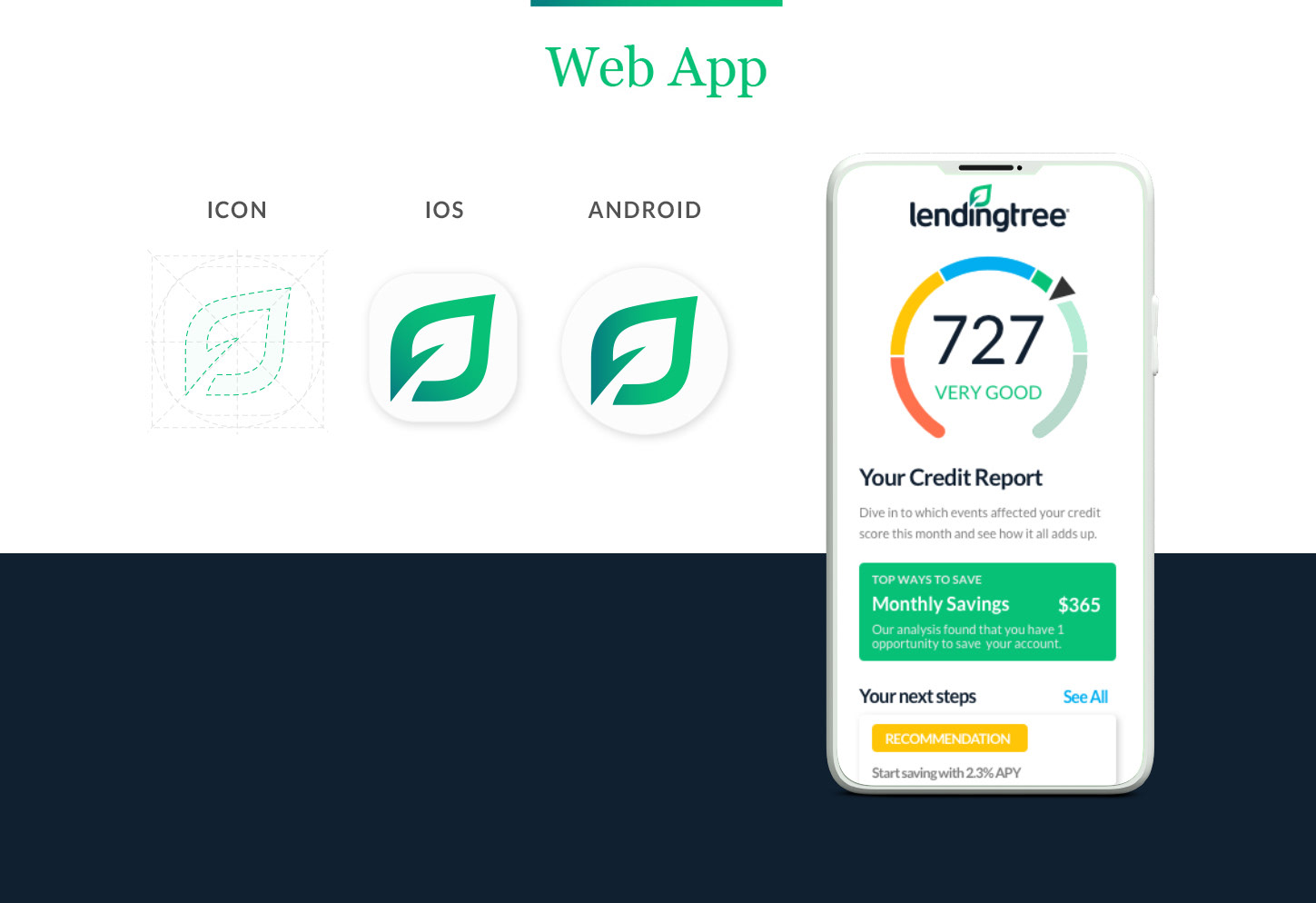
The Logo
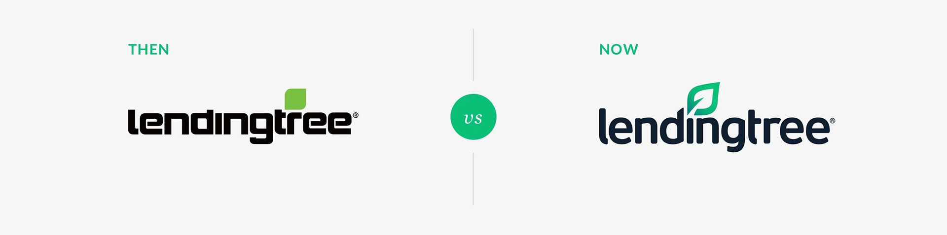
Out with the old, in with the new
Out with the old, in with the new
Less dense and robotic. Organic and easier to read when reduced. A more ownable, usable logomark. Updated colors that symbolize calm, new beginnings, and growth.
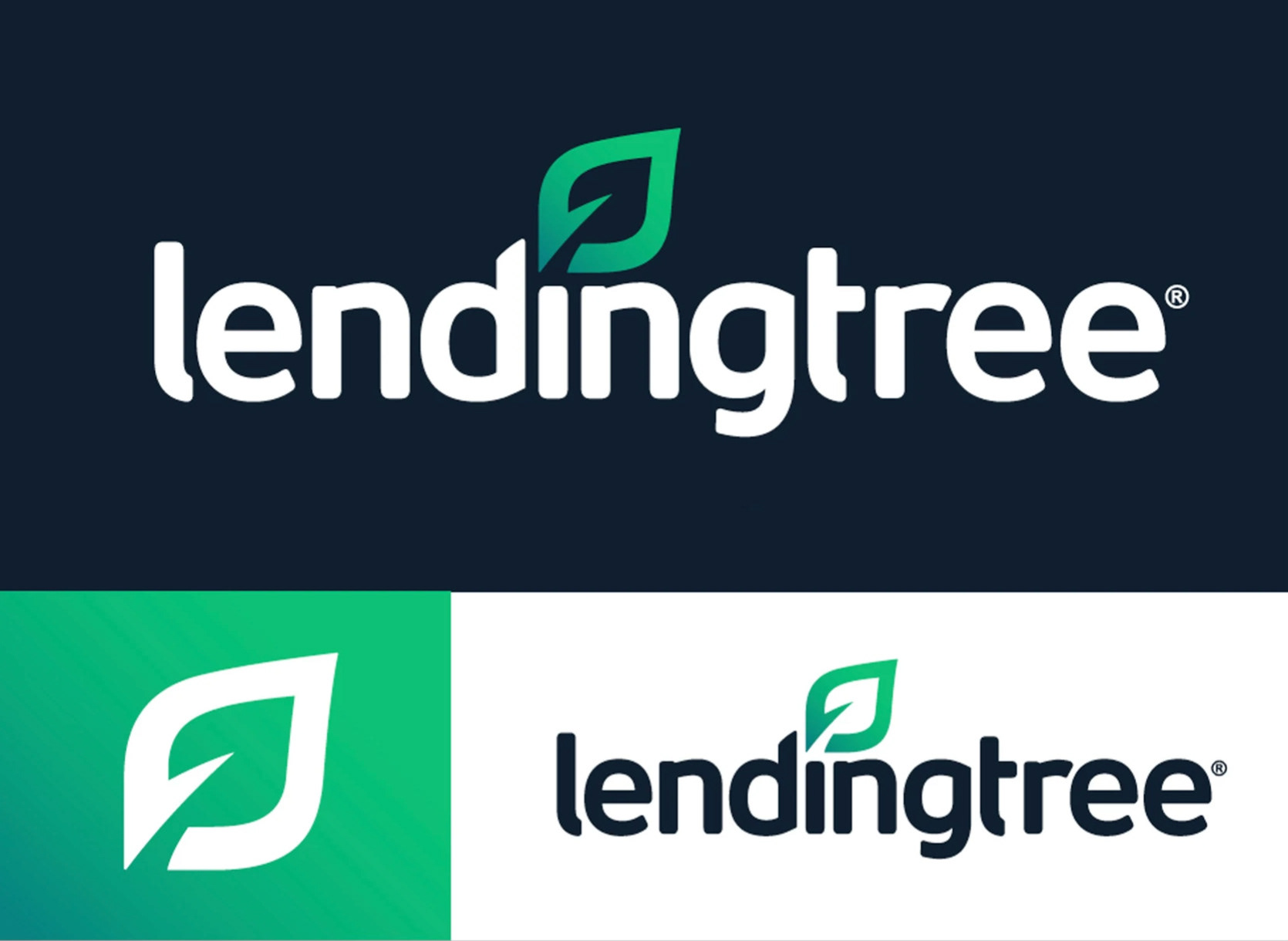
Details
Subtle but purposeful
Subtle but purposeful
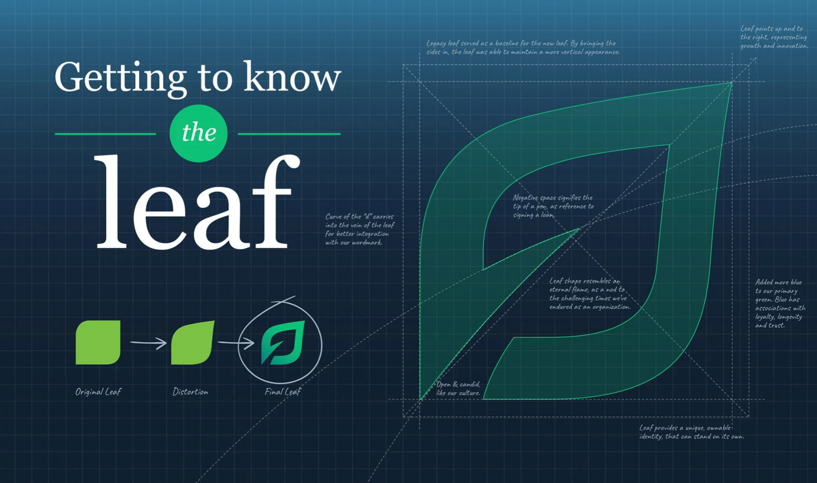
The implied line from the ascender on the letter d into the vein of the leaf logomark guides the eye up and to the right, representing progress and growth.
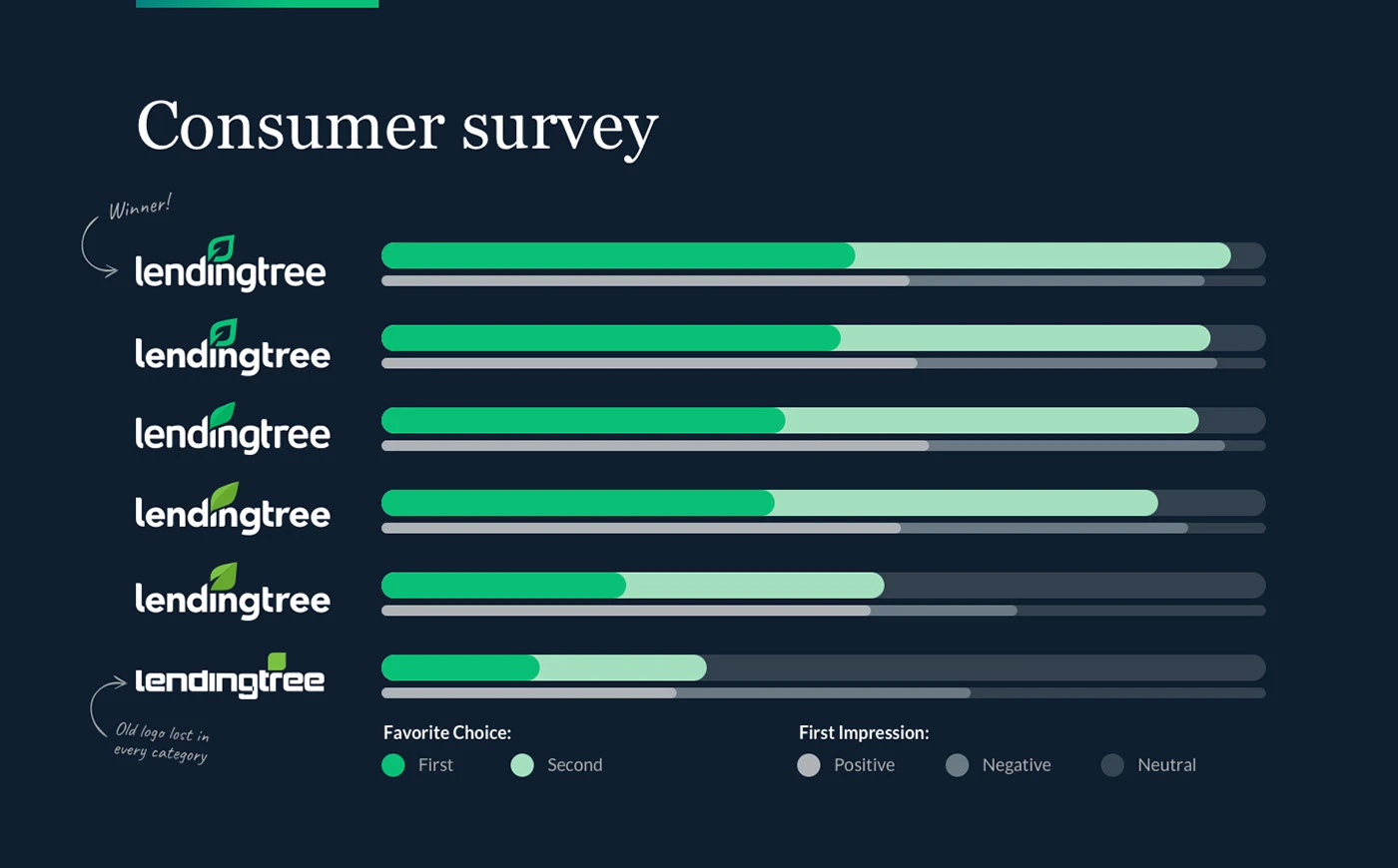
Test it and see
What resonates with the audience?
What resonates with the audience?
After rounds of internal critiques, we tested the final variations to help determine the clear winner.
Colors
Trustworthy. Approachable. Distinct.
Trustworthy. Approachable. Distinct.
A curated palette of core greens and deep blues established credibility, while brighter accents added warmth and emphasis at key moments of interaction. Flexible neutrals ensured readability and accessibility across complex UI states and brand touchpoints.

Signature Visuals
Uniquely connecting customers & products
Uniquely connecting customers & products
"Image Bouquets" featuring casual poses blended with exaggerated scale and product highlights illustrate how easy it is to find what you need with LendingTree.